TransUnion's credit monitoring app redesign
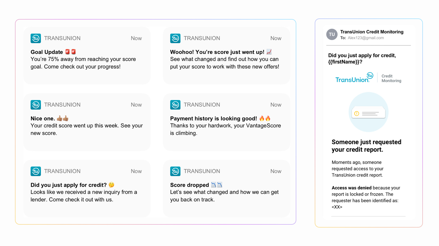
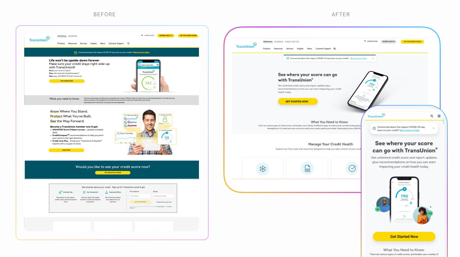
Objective: Modernize the flagship mobile app UX and value prop by leveraging the evolved brand aesthetics, creating a reusable component library system, addressing key ADA / usability issues and developing a competitive premium credit monitoring offer.
Platforms: iOS, Android
KPIs: Increase engagement, Improve CSAT, Increase speed to market (Reusable UI system)
Our business case & results we delivered
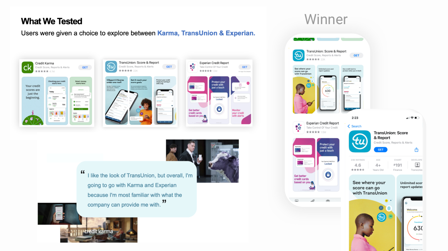
Alongside my product counterpart we educated the business on the importance of having a strong mobile app presence specifically for future demographics and above was a video we creates to generate the hype. While this was for vision purposes, we were still able to deliver results with a basic redesign.
Due to the improvements, we took our organic 2020 $1.16mm annual in revenue and grew it 180% to $3mm in 2021 then to $5mm (with no marketing dollars).
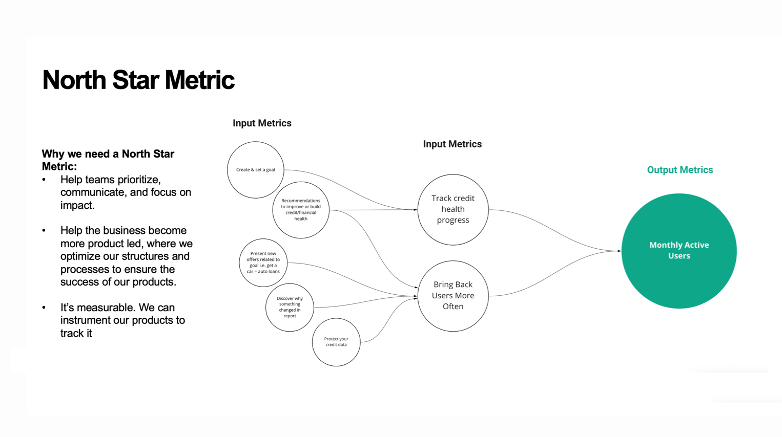
Defining the target consumer + north star
As shown in our vision video, consumers choosing to use the app, skewed on the lower end credit scores, much younger, and were using iOS 70% more than Droid users which gave us great confidence on their overall goals and needs that ultimately helped us craft a north star metric.


